Featured Topics
Featured Products
Events
S&P Global Offerings
Featured Topics
Featured Products
Events
S&P Global Offerings
Featured Topics
Featured Products
Events
S&P Global Offerings
Featured Topics
Featured Products
Events
Language
Featured Products
Ratings & Benchmarks
By Topic
Market Insights
About S&P Global
Corporate Responsibility
Culture & Engagement
Featured Products
Ratings & Benchmarks
By Topic
Market Insights
About S&P Global
Corporate Responsibility
Culture & Engagement
S&P Dow Jones Indices — 21 May, 2021
By Anu Ganti
This article is reprinted from the Indexology blog of S&P Dow Jones Indices.
After the dominant performance of large-cap technology stocks in 2020, concentration concerns naturally come to mind. The HHI, or Herfindahl-Hirschman Index, is a widely-used concentration measure; it’s defined as the sum of the squared index constituents’ percentage weights (usually taken as whole numbers). For example, the HHI for an equally-weighted 50 stock portfolio is 200 (50 x 22); the HHI for the S&P 500 Equal Weight Index, which comprises 500 stocks, is 20 (500 x 0.22).
Other things equal, a higher HHI indicates an increased level of concentration, but as the simple illustration above shows, even for completely unconcentrated equal weight portfolios, the HHI level is inversely related to the number of names. So as we use the HHI to make comparisons within the Tech sector over time, we need to use an adjusted metric. The adjusted HHI is the sector’s HHI divided by the HHI of an equal-weighted portfolio with the same number of stocks. A higher adjusted HHI means that a sector is becoming more concentrated, independently of the number of stocks it contains.
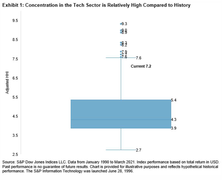
Exhibit 1 shows a box-plot of the S&P 500 Information Technology’s adjusted HHI, using monthly observations since January 1990. We observe a median value of 4.3, interquartile range from 3.9 to 5.4, minimum of 2.7, and eight large outliers. Interestingly, the current adjusted HHI level of 7.2 is at the 95th percentile, indicating a historically high level of concentration for the Technology sector.

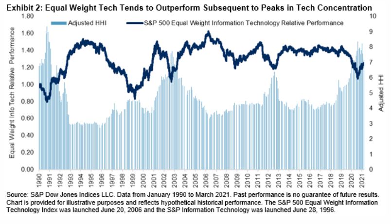
Exhibit 2 illustrates the relationship between the Tech sector’s adjusted HHI with the relative performance of the S&P 500 Equal Weight Information Technology compared to its cap-weighted counterpart. After peaks in concentration (such as during 1990, 1999, and 2002), equal-weighted Tech seems to outperform.

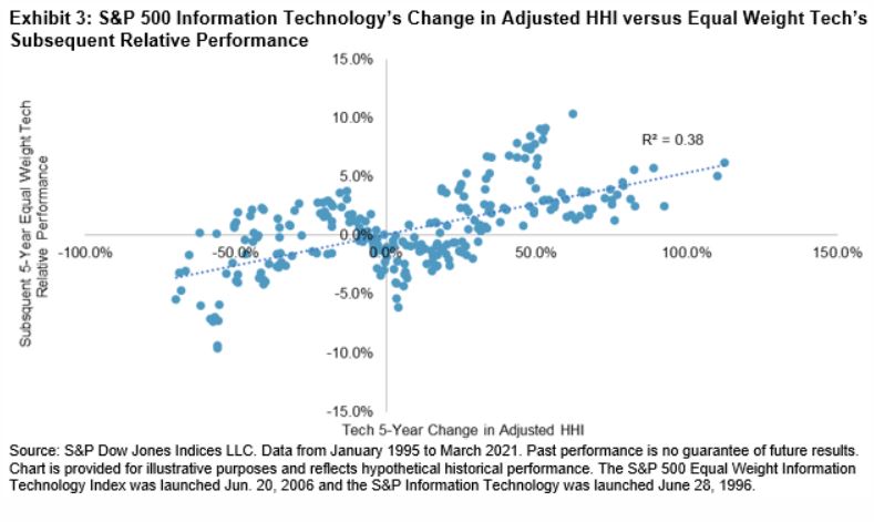
Another way to understand the relationship between concentration and relative performance is to plot the change in Tech’s adjusted HHI versus equal-weighted Tech’s relative performance (see Exhibit 3). We observe a positive relationship between concentration and subsequent performance of equal weighting within Tech, with an R2 of 0.4.

The strong performance of large-cap Tech names last year led to an increase in the sector’s concentration levels. History tells us that after peaks in concentration, equal-weighted Tech has tended to outperform. We can look to history to provide perspective on these trends.
The posts on this blog are opinions, not advice. Please read our Disclaimers.
Content Type
Location
Segment
Language